
hmm which looks better?
this was a shirt commission i done for a maternity wear, the design is about things that go through a womans mind when there pregnant or things that revolve around choldhood. like cuddly toys and candy ect.
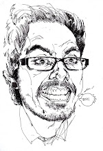
had to do a second version of the design as the 1st design was a tad complicated as it was hard to make out the things in the hair as well as the face looking a bit gloomy.
the second design was much clearer and better lookin, with the face being the focus point as its nice and simple n now shade to it and also the hair is less intricate so the main objects in the hair are easy to make out.


3 comments:
Second one is better. First one does not have enough "mom" images.
I prefer the second one as well. :) Very nice work.
thanks !
yeh the art director said she prefers the second 1 too. relates more to motherly things compared to the other design that kinda relates to womens interest in fashionable items.
though i kinda like the face on the first design even though it is a tad gloomy n alot of depth init.
Post a Comment